Blog

  • Galaxy Z Flip 8: Gorgeous, Sure. But That Price? C’mon, Samsung.

    Galaxy Z Flip 8: Gorgeous, Sure. But That Price? C’mon, Samsung.

    Key Takeaways

    • The Z Flip 8’s new design is absolutely stunning – thinner, sleeker, and a real head-turner. Samsung nailed the aesthetic this time.
    • Performance got its expected yearly bump. It’s fast, don’t worry about that, but it’s not a game-changer.
    • The price tag, though. It’s still a massive hurdle, keeping this beautiful tech out of most people’s hands.
    • Samsung isn’t pushing the envelope enough to make foldables a truly mainstream, value-packed purchase.

    The Story

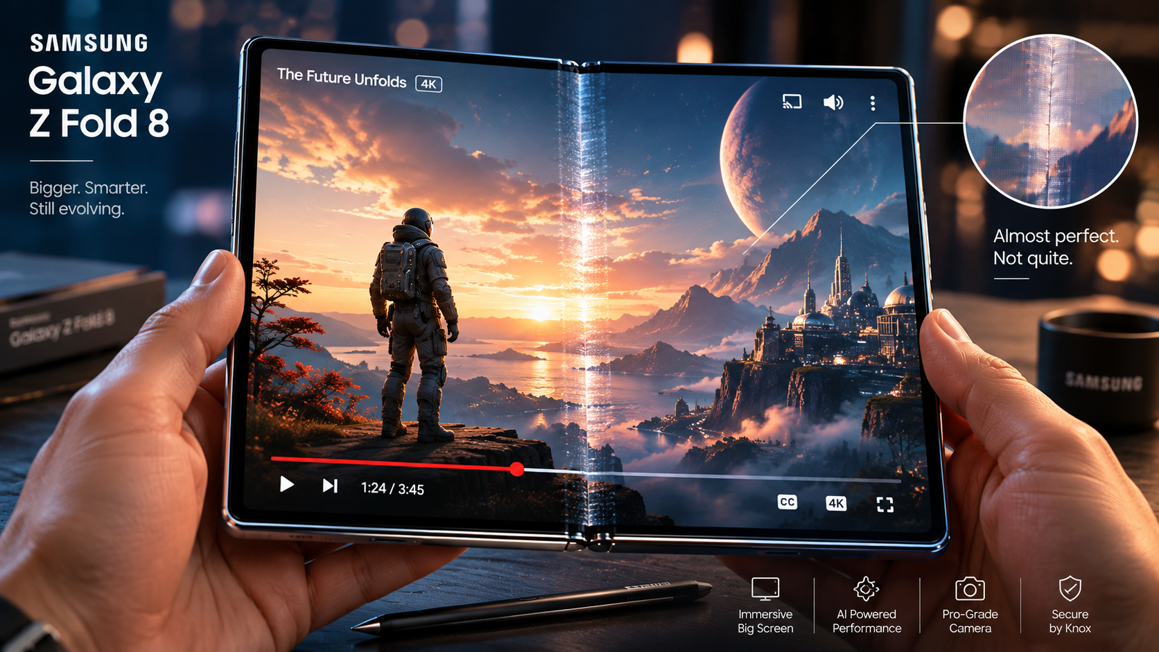
    Alright, folks. We’ve just gotten our first good look at the Galaxy Z Flip 8, and let me tell you, my initial reaction was a solid, unironic, “Damn, that’s pretty.” You know how it is with these new phone reveals, right? Sometimes it’s a yawn, sometimes it’s a “Wait, they actually made it thinner?” This one? It’s the latter. Seriously. Samsung’s finally cooked up a Z Flip that truly feels like a high-fashion accessory, not just a cool gadget. They’ve done it. It’s genuinely thin. We’re talking sleek, almost impossibly so when it’s closed. It doesn’t have that chunky, kinda gappy look we’ve seen before. This thing feels premium. It feels finished. And I gotta say, I adore that thin look.

    But here’s the catch. And you knew there’d be one, didn’t you? Because this is Samsung we’re talking about, and this is the foldable market we’re living in. That initial “adore” quickly turned into a squint, then a sigh, as I started digging into the rest of the package. Yeah, it’s got the latest Snapdragon chip. Of course it does. It’ll be snappy, it’ll handle all your apps, you won’t experience lag. That’s a given, isn’t it? It’s not groundbreaking. It’s just… expected. We’ve seen this movie before.

    Camera improvements? They’re there, sure. A few megapixels here, some AI magic there. Will it suddenly make you ditch your S24 Ultra or your iPhone Pro Max? Nope. Not even close. It’s a good camera for social media, for everyday shots. It isn’t a photography powerhouse. And honestly, it shouldn’t be the primary selling point for a flip phone anyway. People aren’t buying these for the optical zoom capabilities, are they?

    To be fair, Samsung’s been steadily improving the durability. We’re promised a tougher screen, a more robust hinge. And thank goodness for that, because past Flips haven’t exactly been tanks. We’ll have to see how it holds up in the real world, won’t we? Because “supposedly tougher” and “actually tougher after six months in my pocket” are two entirely different things. Make no mistake, though, the design is a win. A huge win. That’s what they got right.

    Pros & Cons / Feature Comparison

    Let’s break down what’s good, what’s just okay, and what’s still got me scratching my head:

    Feature Galaxy Z Flip 8 (My Take) Comparison/Previous Models (What I’m Thinking)
    Design & Form Factor Seriously sleek. This thinness is a game-changer for its aesthetics. It feels so much more refined, finally shedding that bulky vibe. A major win. A noticeable leap from the Flip 7. Less hinge gap, much more compact. They’ve finally made it look as premium as it costs.
    Performance Snappy, as expected with the latest Snapdragon. You won’t have any complaints about speed or app handling. It’s just fast. It’s the annual chip upgrade. Faster than the last one, obviously, but you probably won’t *feel* a massive difference in daily use unless you’re coming from a much older phone.
    Cameras Good enough for most casual shots. It’ll take solid pics for Instagram. But it isn’t an Ultra-level camera setup. Don’t expect miracles. Decent, but still not competing with the top-tier camera phones. It’s not why you’d buy a Flip, and it shows.
    Battery Life Probably a slight bump, but let’s be real, it’s a flip phone. We’re still concerned about getting through a heavy day without reaching for a charger. Always a worry. It’s always been a pain point for smaller foldables. It’s gotta be *significantly* better, not just marginally. We’ll have to wait for real-world tests.
    Durability Samsung’s claiming a tougher screen and improved hinge. That’s good news, isn’t it? But previous Flips had their issues, so fingers crossed it’s genuinely robust. Past models had a reputation for fragility. This needs to be bulletproof to convince wary buyers. Big promises here.
    The Price Tag Ouch. And here’s where my “adore” turns into “don’t bother.” It’s still too expensive for what you’re getting, beautiful design notwithstanding. This is the deal-breaker. Stuck in that premium niche. It hasn’t dropped enough to be truly accessible, which really hinders mass adoption.
    “Flip” Factor Still undeniably cool and super portable. It’s a conversation starter and fits great in a small pocket. The core appeal is still there. The main reason anyone buys this phone. It’s unique, and Samsung’s still doing it best in this form factor.

    Why This Matters

    So, why am I spending so much digital ink on this? Because the Galaxy Z Flip 8 is a symptom of a larger issue. Samsung’s clearly aiming for the fashion-conscious, luxury market with this design. And they’ve hit that target. The phone looks great. It feels great in your hand. But what about the rest of us? The folks who actually want bleeding-edge tech that justifies its insane price, or at least a practical, durable device that doesn’t feel like a compromise?

    The foldable market isn’t exactly exploding, is it? It’s growing, sure, but not at the “next big thing” pace Samsung probably hoped for. And I’m telling you, it’s because of this exact problem: they’re making phones that are “nice-to-have” luxury items rather than “must-have” innovations. Competitors are catching up fast. We’ve got Motorola’s Razr, Google’s Pixel Fold, even OnePlus is playing in this space now. Samsung can’t afford to just iterate on design and call it a day.

    They’ve got to bring something truly transformative to the table. We need better batteries, genuinely pro-grade cameras on these smaller foldables, and a price that doesn’t feel like a punch to the gut. The Flip 8 is proof that Samsung *can* make a gorgeous foldable. Now they just need to make one that makes sense for the average person’s wallet and lifestyle. Until then, it’s just a beautiful, expensive gadget. And that’s a shame, isn’t it?

    Frequently Asked Questions

    Q: Is the Z Flip 8 worth upgrading to from the Z Flip 7?
    A: For most people? Probably not. The design is a big step up, don’t get me wrong, but the core experience hasn’t changed dramatically enough to justify dropping another grand or more. Save your cash, unless you *really* value that sleeker look.

    Q: What’s the biggest improvement in the Z Flip 8?
    A: Hands down, it’s the design. The thinness, the refined hinge, the overall premium feel. Samsung’s finally nailed the aesthetic, making it genuinely feel like a high-end fashion statement. It’s a truly beautiful piece of hardware.

    Q: Will the Z Flip 8 finally make foldable phones mainstream?
    A: Nah, I don’t think so. Not at this price. It’s still a luxury item, a niche device for early adopters or those who prioritize the unique form factor and style over pure value or top-tier specs in every category. The mainstream still wants more bang for its buck, and the Flip 8 just isn’t delivering that.

  • Unpacked 2026: Samsung’s Design “Innovations” – Are We Even Trying Anymore?

    Unpacked 2026: Samsung’s Design “Innovations” – Are We Even Trying Anymore?

    Key Takeaways

    • Samsung’s Galaxy Z Fold 6 and Flip 6 design changes are *marginally* better, not groundbreaking. We’re still talking iterative tweaks, mostly.
    • The new Galaxy Watch 7 (or whatever they’re calling it) feels like a retread, missing a clear, compelling design evolution. Seriously, what gives?
    • The “interview” with Samsung’s design VP, Min-Joon Kim, felt like corporate PR boilerplate, skirting around the real user pain points.
    • Samsung seems stuck in a cycle of refinement, not *redefinition*, letting competitors nip at their heels in the foldable and wearable space.

    The Story

    Alright, folks, another July, another Galaxy Unpacked. And honestly? My coffee’s still steaming, but my enthusiasm? Not so much. We just got off a virtual “interview” with Samsung’s VP of Design, Min-Joon Kim, talking about the shiny new Galaxy Z Fold 6, Z Flip 6, and the latest Galaxy Watch. You’d think, after all these years, after sinking billions into R&D, we’d be seeing something that truly makes you go, “Whoa!”

    But here’s the thing: we’re not. Kim-ssi droned on about “refined ergonomics” and “seamless integration,” buzzwords galore. He said, “We’ve listened intently to our users, making the hinge virtually invisible.” Virtually, huh? I’ve seen magic tricks more convincing. The crease is still there. Maybe it’s a whisper now instead of a shout, but it’s still an unignorable scar on an otherwise premium device. We’re six generations in, people. Shouldn’t we be past “virtually invisible” by now?

    The Z Fold 6, apparently, is “significantly thinner” and “lighter.” Great, you’ve shaved a millimeter here, dropped a few grams there. That’s not innovation; it’s optimization. Necessary? Sure. Exciting? Absolutely not. It’s like buying a new car that’s 0.1 MPG more efficient. You’re not calling your friends about that. And the Z Flip 6? It’s got a slightly bigger cover screen and “new vibrant colors.” Again, nice, but hardly the kind of radical thinking that truly pushes a category forward. It’s like they’re just checking boxes, making sure it doesn’t fall *too* far behind last year’s model.

    And then there’s the Galaxy Watch. Kim-ssi was keen to highlight the “new minimalist aesthetic” and “enhanced material selection.” What does that even mean? To my eyes, it looks an awful lot like the Watch 6, which looked an awful lot like the Watch 5. They’ve maybe tweaked the bezel a bit, added a new sensor that’ll require a firmware update to actually work, and offered some different strap options. But you know what? We’re still getting what feels like two days of battery life if you look at it funny, and the overall design language is just… safe. It’s not bold. It’s not inspiring. It’s just there.

    I get it, iteration is part of the game. But Samsung’s been at the forefront of this foldable push, they *should* be dictating the future. Instead, they’re playing defense, making minor improvements that just aren’t cutting it in a market that’s getting increasingly competitive. You’ll hear them talk about “balancing innovation with user familiarity.” My read? They’re balancing their budget with minimal design risk.

    Pros & Cons / Feature Comparison (Design Focus)

    Galaxy Z Fold 6 & Z Flip 6

    • Pros:
      • Thinner Profile: Yes, it’s slightly less bulky when folded. You’ll notice it, maybe.
      • Reduced Crease Visibility: Kim-ssi says “virtually invisible.” I’ll say “less jarring.” It’s progress, but not the end goal.
      • New Colorways (Flip 6): Some fresh hues could appeal to a wider audience. That’s always a plus, right?
      • Improved Hinge Feel: Apparently, it’s smoother, more robust. That’s a structural improvement, which is good.
    • Cons:
      • Crease Still Present: The big one. It’s the elephant in the room that Samsung refuses to acknowledge as a fundamental design flaw.
      • Similar Form Factors: Visually, if you’re not paying close attention, you’d be hard-pressed to tell it apart from the previous generation. Where’s the wow factor?
      • External Display (Fold 6): Still feels like an afterthought. They haven’t cracked the code on making it genuinely useful for more than quick notifications.
      • No Radical Material Changes: Still glass and aluminum, mostly. Where’s the truly innovative, lighter, more durable stuff we’ve been dreaming of?

    Galaxy Watch 7 (or equivalent)

    • Pros:
      • “Minimalist” Bezel: They’ve trimmed it down slightly. It’s sleeker, I’ll give ’em that.
      • Refined Button Tactility: The buttons supposedly feel “crisper.” A small but welcome ergonomic touch.
      • New Strap Attachment Mechanism: A quicker, easier way to swap bands. That’s a genuine convenience upgrade.
      • New Watch Face Designs: Always a good thing to freshen up the software aesthetic.
    • Cons:
      • Stagnant Core Design: It just *looks* like a Galaxy Watch. Where’s the design leap? Where’s the risk?
      • Limited Battery-Centric Design Improvements: The biggest design constraint for wearables is battery life. They haven’t solved it with a radical form factor or power-efficient display tech.
      • Still a Chunky Puck: While thinner bezels are nice, the overall thickness hasn’t dramatically changed. It’s still a noticeable device on the wrist.
      • No True “Wearable Fashion” Statement: It blends in. It doesn’t stand out. Compare it to some high-end traditional watches or even the Apple Watch’s more fashion-forward approach. It’s just… tech.

    Why This Matters

    Look, Samsung *owns* the foldable market, right? They were the first, they’ve got the most models. So why does it feel like they’re just coasting? This iterative approach to design isn’t just boring, it’s dangerous. You’ve got Google pushing hard with the Pixel Fold, and you know Apple’s foldable isn’t *if*, but *when*. And when Apple enters, they won’t settle for “virtually invisible” creases. They’ll demand perfection, or at least a new kind of compromise.

    The wearable space is just as cutthroat. Samsung’s watches are good, don’t get me wrong. But are they exciting? Do they make a design statement? I don’t think so. The competition, from budget fitness trackers to luxury smartwatches, is innovating faster, or at least *appearing* to. Samsung’s playing it safe, hoping that brand loyalty and ecosystem lock-in will keep people buying. But loyalty only stretches so far when the new hotness keeps coming from elsewhere.

    This matters because Samsung used to be the company that wasn’t afraid to try wild stuff. Remember the curved screens? The S Pen? They weren’t always perfect, but they were *different*. Now, it feels like they’re trying to appeal to the broadest possible denominator, which often means bland. They’ve got the manufacturing muscle, the R&D budget, the supply chain. So why aren’t they swinging for the fences with design? It’s a critical moment for them to solidify their leadership, not just cling to it. Consumers are hungry for something genuinely fresh, something that doesn’t just feel like a slightly better version of last year’s model. Make no mistake, if they don’t bring the heat, someone else will.

    Frequently Asked Questions

    Q: Is the crease really gone on the new Z Fold 6?
    A: According to Samsung’s VP of Design, Min-Joon Kim, it’s “virtually invisible.” In my opinion, and from what we’ve seen, it’s *less prominent* than before, but no, it’s not truly gone. You’ll still see and feel it.

    Q: What’s the biggest design improvement on the Galaxy Watch 7?
    A: They’ve focused on subtle refinements. The bezels are a bit slimmer, the buttons are said to feel better, and there’s a new, quicker strap attachment mechanism. But don’t expect a radical redesign; it’s more of an evolution than a revolution.

    Q: Should I upgrade my Galaxy Z Fold 5 or Watch 6 to these new models based on design?
    A: If design is your primary concern, probably not. The changes are largely iterative. You’re getting minor aesthetic and ergonomic tweaks, but nothing that fundamentally redefines the user experience or the device’s appearance. If you’re hoping for a dramatic visual overhaul, you’ll likely be disappointed.

  • Siri’s Finally *Good*? So Why Does It Feel Like A Funeral, Not A Party?

    Siri’s Finally *Good*? So Why Does It Feel Like A Funeral, Not A Party?

    You heard that right. Apple, in what feels like a decade-late apology tour, has finally, *finally*, made Siri… competent. Not revolutionary. Not mind-blowing. Just, y’know, not terrible. And honestly? Nobody seems to care. It’s anticlimactic, isn’t it?

    For years, we’ve suffered through Siri’s perpetual state of digital dementia. Its inability to understand basic commands, its refusal to grasp context, its endless “I don’t understand that” responses. We’ve collectively rolled our eyes, switched to Google Assistant, or just resigned ourselves to typing things out like it’s 2005. Now, Apple’s saying, “Hey, we fixed it!” And all I can muster is a shrug. A big, weary shrug.

    Key Takeaways

    • Siri has received significant updates, making it genuinely faster, more context-aware, and better at understanding natural language.
    • These improvements, while real, feel like Apple catching up to a race that everyone else finished years ago.
    • The rise of generative AI (ChatGPT, Bard, etc.) has dramatically shifted user expectations, making Siri’s “fix” feel incremental rather than groundbreaking.
    • Apple faces a massive uphill battle in convincing users to re-engage with Siri, given years of frustration and superior alternatives.

    The Story

    Remember When Siri Was A Joke?

    Back in 2011, when Siri first dropped with the iPhone 4S, it was *magic*. Seriously. A digital assistant living in your phone, ready to answer questions, set alarms, or tell you a joke? It felt like the future. For about five minutes, anyway. Then reality hit. Siri was clumsy. It was rigid. It couldn’t remember what you said two seconds ago, could it?

    Google Assistant and Amazon Alexa swooped in, offering genuinely better conversational experiences. They were smarter. They were faster. They integrated with more stuff. Siri, meanwhile, became the punching bag of the tech world. A perpetual meme for AI gone wrong. We’ve all got stories, haven’t we? Asking it to call your wife and it dials your landlord. Classic Siri.

    Years passed. Apple released new iPhones, new Macs, new watches, all with the same fundamentally flawed Siri. We kept asking, “When’s Apple going to fix Siri?” And for the longest time, the answer felt like a resounding, “Never!”

    So, What’s “Fixed,” Exactly?

    Here’s the thing: they actually *have* made it better. Make no mistake, this isn’t just lipstick on a pig. Apple’s done some serious re-engineering, reportedly building Siri from the ground up on new neural architectures. What does that mean for you? Well, for starters:

    • On-Device Processing: A lot of what Siri does now happens right on your device. That means it’s faster. Seriously, it’s noticeably snappier. Plus, it’s better for privacy, as your queries aren’t always being shipped off to Apple’s servers. That’s a win-win, isn’t it?
    • Contextual Awareness: This is a big one. Siri finally remembers what you just said. You can ask “What’s the weather?” and then follow up with “How about tomorrow?” or “What’s the forecast in Paris?” and it *gets* it. You don’t have to repeat the entire query. It’s not a goldfish anymore.
    • Natural Language Understanding: It’s better at interpreting how humans actually talk. Less robotic phrasing needed. You can speak more colloquially, more naturally. It’s an improvement. A significant one.
    • Chained Commands: Want to send a message, then set a reminder, then play some music? You can chain those commands together. It’s not perfect, but it’s a huge step up from the one-and-done limitations we’ve dealt with for so long.

    So, yeah, it’s not bad. It’s actually… pretty good for what it is. It’s capable. It’s reliable. It’s the Siri we probably should’ve gotten five years ago. And that, my friends, is the crux of the problem.

    Siri’s Glow-Up: The Good, The Bad, The “Why Now?”

    Let’s break down where Siri stands now. We’ve waited a long time, haven’t we? It’s fair to ask: was it worth it?

    The Good Stuff (Pros)

    • Speed & Privacy: On-device processing is a big win. Your data stays put more often, and commands execute faster. No more awkward pauses while Siri ‘thinks’. That’s a definite plus, isn’t it? When you’re trying to set a timer while your hands are full, every second counts.
    • Contextual Smarts: Finally, it remembers what you just said! Asking follow-up questions doesn’t feel like talking to a goldfish anymore. You can chain commands. “Play some jazz.” “Loud.” “No, change that to Miles Davis.” Used to be a nightmare. This alone makes it far less frustrating to use for multi-step tasks.
    • Natural Language: It *actually* understands colloquialisms better. Less robotic input needed. A little more human-like, you’d say. This reduces the friction of interacting with it, making it feel less like you’re talking to a machine and more like a helpful, if slightly limited, assistant.
    • Reliability: It simply fails less often. The “I don’t understand” responses are significantly rarer. It’s dependable for common tasks. And honestly, isn’t that what we always wanted?

    The Not-So-Good (Cons/Limitations)

    • Still Limited Scope: It’s better, sure, but it’s not a true conversational AI. It can’t debate philosophy or write a novel. It’s still primarily a command-and-control interface, just a smarter one. It won’t brainstorm ideas for you. It’s not a creative partner.
    • Generative AI Gap: This is the big one. While others are playing with ChatGPT-level generative AI, Siri’s “smart” feels like yesterday’s smart. It’s predictive, not creative. It doesn’t *think* like an LLM, does it? It can’t synthesize new information or engage in open-ended conversations that truly push boundaries.
    • Third-Party Integration: Still a walled garden, mostly. Its true power often stops at Apple’s apps or very specific integrations. Google Assistant and Alexa feel more open, more capable of interacting with the broader digital ecosystem. You can’t just tell Siri to do anything in any app.
    • The “Too Late” Factor: Seriously, Apple? You’ve had over a decade. Competitors haven’t just caught up; they’ve sprinted miles ahead. This feels like catching up to a race that finished five years ago. The market moved on. User habits solidified.

    Why This Feels So Anticlimactic

    So, Siri’s fixed. Great! Why isn’t anyone popping champagne? Why isn’t this the biggest news story of the year? Think about it. We’ve been through a lot, haven’t we? The tech world doesn’t wait around for anyone.

    Expectation vs. Reality: User expectations for AI have skyrocketed. We’ve played with ChatGPT. We’ve seen generative images. We’ve interacted with AI that can write entire articles or compose music. Siri’s improvements, while genuinely helpful, don’t meet *today’s* AI bar. It’s like bringing a really good flip phone to a smartphone convention. It’s competent, but it’s not mind-blowing. It just doesn’t evoke that “wow” factor anymore.

    Apple’s Brand & Innovation: Apple thrives on “magical” moments. The iPod, the iPhone, the Apple Watch, even the Vision Pro, they all aimed for that feeling of something new, something *better*. Siri’s fix isn’t magical; it’s overdue maintenance. It feels like fixing a leaky faucet that’s been dripping for a decade. Does it signal a larger lag in their AI strategy? Are they truly behind on the generative AI wave? It sure feels that way, doesn’t it?

    User Habit & Loyalty: People have adapted. We’ve learned to work around Siri’s limitations or simply switched to alternatives. We use Google Assistant for complex queries, ChatGPT for generative tasks, or just type. Re-engaging millions of users with a *merely competent* Siri is a huge uphill battle. Why switch back to “pretty good” when “mind-blowing” exists elsewhere, often just a tap away? Habits are hard to break.

    The Competition Isn’t Sleeping: Google and OpenAI aren’t waiting. They’re iterating at lightning speed, pushing the boundaries of what AI can do every single day. Apple’s “fix” just puts them back on the starting line of a new race. But everyone else is already halfway through the marathon. They’re not just competing with other voice assistants anymore; they’re up against a whole new generation of AI that can do so much more.

    Ultimately, Siri’s competence is a welcome development. But it’s competence in a world that now demands genius. And that’s why it feels less like a celebration and more like a sigh of relief, quickly followed by a feeling of “what took you so long?”

    Your Burning Questions, Answered (Probably)

    Got thoughts? You’re not alone. Here’s what folks are usually wondering:

    Q: Is the “fixed” Siri actually *good* now?

    A: Yeah, it’s definitely *better*. It’s faster, understands context, and makes fewer dumb mistakes. It’s gone from frustrating to functional. You won’t want to throw your phone across the room using it for basic tasks anymore. But don’t expect it to write your term paper or explain quantum physics like a professor, okay? It’s not *that* good. It’s good enough for everyday tasks, which is a massive improvement from where it was.

    Q: Why did Apple wait so long to fix it?

    A: Good question, isn’t it? Lots of speculation. Some folks point to internal politics or a lack of focus on software services in favor of hardware. Others say they had to completely re-architect things from the ground up, which takes a monumental amount of time and effort. It wasn’t just a simple patch; it was a deep overhaul. But years? C’mon. Many believe they just underestimated the importance of keeping pace with the competition.

    Q: Should I start using Siri again now?

    A: You know what? Give it a shot. For basic tasks, like setting timers, checking weather, controlling smart home stuff, or sending a quick message, it’s perfectly capable now. It’s genuinely useful for those things. For anything complex, or if you want a real conversation with a generative AI, you’re probably still better off with a dedicated large language model like ChatGPT or Google Bard. It really depends on what you’re looking for, doesn’t it? Don’t expect miracles, but don’t write it off for simple convenience either.

  • Android 17 QPR2 Beta 2: Is Google Even Trying Anymore, Or Just Hitting Snooze?

    Android 17 QPR2 Beta 2: Is Google Even Trying Anymore, Or Just Hitting Snooze?

    Key Takeaways

    • Android 17 QPR2 Beta 2 is here, and honestly? It’s more of the same — tiny tweaks and fixes. Don’t expect a revolution.
    • Google’s pushing some welcome, if minor, UI refinements, like that adjusted system share sheet. It’s nice, but it’s not groundbreaking.
    • We’re still waiting for real innovation. This beta feels like a holding pattern, not a sprint forward. Why are we paying beta testers for this?
    • Performance bumps? Sure, there’s always talk. But let’s be real, a lot of folks aren’t seeing massive differences. Stability, though? That’s always a plus.

    The Story

    Alright, folks, gather ’round. We’ve just gotten our grubby little paws on Android 17 QPR2 Beta 2, and after spending some quality time with it, I’ve gotta ask: What exactly is Google playing at here? Seriously. Another quarterly platform release, another beta, and it feels less like a thrilling step forward and more like… well, like someone just tidied up their desk a little. We’re talking minor adjustments, a few bug fixes, and what feels like an almost intentional lack of anything truly exciting. It’s frustrating, isn’t it?

    First off, let’s talk about the usual suspects. You’ve got your obligatory stability improvements. They’re there. Supposedly. And hey, nobody’s gonna complain about a more stable phone, right? But here’s the thing: shouldn’t that be a given at this point? We’re on Android 17, for crying out loud. We shouldn’t still be having these “stability improvements” as a headline feature for a *beta* release. It’s like celebrating a car that finally starts reliably after three years.

    What’s New (or, More Accurately, “Barely Changed”)

    So, what *is* new in this QPR2 Beta 2? Not a whole lot that’ll make your jaw drop, let me tell you. For starters, they’ve tinkered with the system share sheet. You know, that thing you use to send photos to your mom or a link to your buddy. It’s a bit more organized, a little cleaner. Honestly, it’s a good change. It works better. But it’s not the kind of thing you write home about. It’s a quality-of-life tweak that *should’ve* been baked in ages ago. Think about it. We’ve been asking for a decent share sheet for years.

    Then there are the theme adjustments. A few new accent colors might pop up for some users. Pixel devices, as usual, get a little extra polish here and there. It’s a minor aesthetic refresh, for sure. But again, are we really cheering for new shades of blue? I don’t think so. We’re talking about a mobile operating system that’s supposed to be pushing boundaries, not just repainting the walls.

    We’ve also seen some whispers about a refined quick settings panel. Some icons might look a little different. Maybe a new animation here or there. It’s all very subtle. So subtle, in fact, you might not even notice it unless you’re staring intently at your screen, side-by-side with an older build. That’s the problem, isn’t it? These “updates” often feel less like innovation and more like shuffling deck chairs on the Titanic, just with less drama.

    To be fair, there are always some under-the-hood performance tweaks. We’re told apps should launch a bit faster, animations feel smoother. And yeah, some power users might feel it. But for your average Joe, who’s just scrolling TikTok or answering emails? They’re probably not gonna notice a huge difference. It’s like getting a new processor in your computer and then only using it for Notepad. Not quite the thrilling upgrade you’d hope for.

    Pros & Cons / Feature Comparison

    Let’s break down what’s actually in this QPR2 Beta 2, and what’s still missing from the wishlist.

    Feature/Area Pros in Beta 2 Cons / Still Missing
    System Share Sheet Improved organization, cleaner UI. It’s easier to find apps and contacts now. Long overdue fix; not a new feature, just a necessary refinement. Where’s the deep customization we really want?
    Overall Stability & Performance Reported bug fixes, smoother animations, apps feel a tad snappier. Less crashing, which is always good. Still experiencing some occasional jank on older Pixel devices. We’re not seeing a massive leap forward.
    Theming & UI Subtle new accent color options. Quick settings panel gets a minor facelift, icons are slightly adjusted. Barely noticeable changes for most users. Still lacks truly deep theming options across all UI elements.
    New User-Facing Features …crickets… Honestly, there aren’t any big ones to point to here. No significant, impactful new features. Where’s the innovation? What are we supposed to get excited about?
    Privacy & Security Patches for vulnerabilities. Standard stuff. That’s always a good thing. Nothing revolutionary in terms of *new* privacy controls or transparency features. Just the regular monthly updates.

    Why This Matters

    Here’s the thing: these QPR betas are supposed to be a little taste of what’s coming, a chance for Google to drop some new goodies or fix major pain points before the main stable release. But when you look at Android 17 QPR2 Beta 2, it feels like Google’s just going through the motions. It’s not inspiring. It’s not pushing Android forward in any meaningful way that’ll get people talking.

    It says a lot about where Android’s at right now. We’re past the wild west days of radical new features with every major update. Now, it’s about refinement, stability, and making the existing experience a little nicer. And that’s fine, to a point. But when the “refinements” are things like a slightly better share sheet – something users have wanted for years – it really makes you wonder if Google’s lost its spark. Where’s the creativity? Where’s the audacious vision we used to see?

    This matters because Android’s gotta compete. It’s not just about iOS anymore; it’s about keeping users engaged, making developers excited, and pushing the boundaries of what a mobile OS can do. If QPRs like this are all we’re getting, it sends a message. And that message isn’t exactly “innovation leader.” It’s more like, “We’re comfortable. Maybe too comfortable.” We deserve more. Our phones deserve more. Don’t you think?

    Frequently Asked Questions

    Q: Should I install Android 17 QPR2 Beta 2 on my main device?
    A: Honestly? Probably not. It’s a beta. While it seems relatively stable, you might hit some bugs. And for what? A slightly better share sheet? Unless you’re a developer or just love being on the bleeding edge for tiny changes, you’re not missing much by waiting for the stable release. Save yourself the potential headache.

    Q: What’s the biggest improvement in this beta?
    A: Make no mistake, the improved system share sheet is probably the most tangible, user-facing change. It’s not a flashy new feature, but it’s a quality-of-life improvement that many will appreciate. But again, it’s a minor thing. Don’t expect fireworks.

    Q: Why does Google release these betas if there isn’t much new?
    A: Good question! Part of it is testing for stability and compatibility across devices and apps. It helps them iron out bugs with real-world usage. But another part of me thinks it’s just part of their scheduled release cycle. They’ve gotta show *something*. And often, that something isn’t much more than incremental fixes. It’s a bit of a head-scratcher, isn’t it?

  • Google Health 5.05 Lands: Apple Sync, But Seriously, Who Cares Anymore?

    Google Health 5.05 Lands: Apple Sync, But Seriously, Who Cares Anymore?

    Key Takeaways

    • Google Health 5.05 just rolled out, bringing some long-overdue bug fixes.
    • The big news? It supposedly now syncs with Apple Health. We’ll see how that actually plays out.
    • It’s another small step in Google’s perpetually awkward health tech journey.
    • Don’t expect a revolution; Google’s track record here isn’t exactly stellar.

    The Story

    Alright, folks, buckle up. Google Health, that app many of us forget even exists, just pushed out version 5.05. And hey, it’s got “bug fixes”! Shocker. But here’s the kicker, the one little nugget that’s supposed to get us all hyped:

    Apparently, it now plays nice with Apple Health. Yeah, you heard that right. Cross-platform sync. A moment many folks didn’t even realize they were waiting for, but now it’s here. Sort of.

    For starters, let’s just address the elephant in the room. Google’s health ambitions? They’re a mess. We’ve seen ’em try with Google Fit, Project Baseline, that whole Fitbit acquisition that felt like it was going somewhere but then… didn’t quite stick the landing. It’s a classic Google move, isn’t it? Dive headfirst into a space, make a bunch of noise, then kinda… lose interest. Remember Google Reader? Oh, you don’t? My point exactly.

    So, now we’ve got 5.05, and it’s supposed to bridge the data gap between Android and iOS. On paper? That sounds kinda cool. You’ve got your steps, your heart rate, maybe some sleep data, all potentially flowing between these two tech giants. Think about it. One place for your health info, regardless of your phone allegiance. Dreamy, right? Not quite. My gut tells me this is less about genuine ecosystem interoperability and more about Google desperately trying to stay relevant in a health tech game that Apple’s been winning for years. They’re playing catch-up, plain and simple. And let’s be real, bug fixes are like the bare minimum, aren’t they? It’s like saying, “Hey, we fixed the flat tire… on a car with no engine.”

    Pros & Cons / Feature Comparison

    Okay, so let’s break down what this update supposedly brings to the table, and what it really means for us, the actual users. You’ll want to take some of these “pros” with a huge grain of salt, by the way.

    • The “Pro” List (use with caution):
      • Apple Health Sync: The big headline. If it works seamlessly (and that’s a HUGE “if”), it could mean your health data isn’t locked down to one platform. Imagine! Your Apple Watch steps showing up in Google Health. Your sleep data from a Fitbit, maybe. The idea’s nice.
      • Bug Fixes: Yeah, they fixed some stuff. We don’t know what, exactly, but presumably the app won’t crash as much or misreport your morning jog as a sprint to the moon. This is just… expected, isn’t it?
      • Potential for Broader Integration: Maybe, just maybe, this opens the door for other devices and services to link up more easily. It’s a tiny glimmer of hope for a more unified health data experience. But don’t hold your breath.
    • The “Con” List (the brutal truth):
      • Google’s Abandonment Issues: Let’s be honest, Google has a history. A long, sad history of launching things with fanfare only to kill them off a few years later. Why should health data be any different? You’ll invest your personal info, and then poof! Gone.
      • Data Privacy Concerns: Are you really, truly comfortable with Google having even more of your sensitive health data? Make no mistake, they’re a data company. Your heart rate is just another data point. Think about it.
      • Too Little, Too Late: Apple Health is entrenched. It’s got an ecosystem of devices, apps, and user trust. Google’s still fumbling around. This sync feels like a reactive move, not a proactive one. It’s not gonna suddenly make Google Health a must-have.
      • Limited Functionality: Even with sync, Google Health itself isn’t exactly a powerhouse. It’s pretty basic. It doesn’t offer the deep insights or robust features you’d find in dedicated health apps or even Apple’s native offering.
      • It’s Still Google: We’ve seen their UI choices, their update cycles, their general lack of consistency. Don’t expect a polished, seamless experience just because they’ve finally decided to “sync.”

    Why This Matters

    Here’s the thing: this update, while seemingly minor, does highlight Google’s ongoing struggle in the health tech space. Apple’s Health app, connected to the Apple Watch and a vast network of third-party apps, has become a genuine force. They’ve built trust. They’ve built an ecosystem. Google? They’re still trying to figure out if they want to be a player or just a bystander who occasionally shouts from the sidelines.

    This “sync” feels less like innovation and more like an admission that they can’t beat ’em, so they might as well try to join ’em… at least partially. Is it about data? You bet it is. Google wants a piece of that health data pie, no matter how small. They want to connect the dots. But do users want Google connecting those dots with their most private information, especially given their track record?

    For me, it’s a question of commitment. Does this signal Google’s newfound, unwavering dedication to personal health? Or is it just another feature they’ll sunset when the next shiny thing catches their eye? I’m betting on the latter. It’s tough to build a robust health platform when you’re constantly yanking the rug out from under your users. This 5.05 update won’t change that perception overnight. It’s just a band-aid on a much larger, more systemic issue within Google’s long-term product strategy. Or lack thereof, depending on who’s asking.

    Frequently Asked Questions

    Q: What exactly does Apple Health sync mean for me?
    A: It means Google Health *should* now be able to read and write some of your basic health data (like steps, heart rate, maybe sleep) to and from Apple Health. It’s about data exchange, not a full merger of the apps or anything that deep. You’ll still use both, probably. Or just one, really.

    Q: Is Google finally serious about health tech now?
    A: Don’t bet the farm on it. Google’s “seriousness” in health has always been cyclical. They’ve launched, tweaked, and killed off so many health initiatives over the years. This update feels more like a necessary check-box than a renewed, passionate commitment to revolutionizing your well-being. They’ve gotta compete, so they’re trying.

    Q: Should I switch to Google Health now because of this sync?
    A: Nah. If you’re happily on Apple Health, stick with it. It’s more mature, more integrated into the Apple ecosystem, and frankly, more trustworthy in terms of long-term commitment. If you’re on Android and already use Google Health, this might make it slightly more useful if you also dabble in the Apple world, but it’s not a reason to jump ship from any other dedicated health app you’re already using.

  • Xbox 360 on PC? Microsoft’s Playing Games, And We’re All Just Pawns in Their Game Pass Saga

    Xbox 360 on PC? Microsoft’s Playing Games, And We’re All Just Pawns in Their Game Pass Saga

    Key Takeaways

    • Microsoft’s apparently bringing a selection of Xbox 360 games to PC, officially.
    • Don’t get it twisted: this isn’t native emulation or a gift. We’re talking cloud streaming via Game Pass Ultimate.
    • It’s a calculated move to bolster Game Pass subscriptions and push their cloud gaming platform, plain and simple.
    • Expect caveats galore – think latency, limited libraries, and absolutely no ownership for you, pal.

    The Story

    Alright, stop the presses. Hold your horses. Whatever you wanna say, just *hold up*. Microsoft just dropped news that’s got everyone in a tizzy, screaming about nostalgia and classic games. You’ve probably seen the headlines already: Xbox 360 games are officially coming to PC. Sounds incredible, right? Like a dream come true for anyone who grew up mashing buttons on that iconic console.

    But here’s the thing: whenever Microsoft dangles a shiny new toy in front of us, my internal bullshit detector starts buzzing like a hornet’s nest. You know it. I know it. We all know it. This isn’t some altruistic act of digital preservation. It’s never just that. There’s a game being played, and we’re all just trying to figure out the rules.

    For starters, let’s cut to the chase. When they say “Xbox 360 games on PC,” what they really mean is “Xbox 360 games on PC *via Xbox Cloud Gaming*.” See that asterisk? That’s where the magic dies. We’re not talking about some miraculous, natively optimized PC ports for *every* single classic title. We’re talking streaming, baby. And with streaming, you’re not getting a faithful, high-performance experience. You’re getting whatever your internet connection can muster, with a side of potential input lag and visual artifacts.

    Think about it. Why now? Why didn’t they do this years ago? Is it suddenly a passion project? Hardly. This is a cold, calculated business decision. It’s about getting more eyeballs on Game Pass. It’s about pushing their cloud infrastructure. It’s about convincing you that Xbox Game Pass Ultimate isn’t just a good deal for new games, but for old ones too. It’s always about the subscription. Always.

    The Catch: It’s All About That Cloud

    Make no mistake, this isn’t some retro emulator bundled into Windows. You won’t be downloading *Red Dead Redemption* to your SSD and tweaking graphics settings. Nope. You’ll be connecting to a server farm somewhere, hoping your ping isn’t having a bad day. That’s a huge distinction. A critical one, actually.

    We’re talking about games designed for a specific hardware architecture, now being emulated on a server, compressed, and then streamed to your device. It’s a multi-layered cake of potential issues. Some games will probably feel fine. Slower-paced RPGs? Sure, why not. But what about something fast-paced, like *Gears of War* or *Forza Horizon*? That input lag, even a tiny bit, could be a deal-breaker. You won’t be hitting those headshots, trust me.

    And then there’s the library. Are we getting *all* the 360 games? Don’t be naive. We’ll get a curated selection, probably the ones Microsoft owns, and maybe a few others they’ve managed to license without breaking the bank. So, if you’re hoping for every obscure gem from your youth, you’ll probably be disappointed. It’s never that simple. It never is.

    Pros & Cons (Let’s Be Real)

    Here’s a quick rundown of what we’re *actually* looking at:

    • The “Pros” (read: Microsoft’s talking points):
      • Access to Classic Titles: Yeah, you can play some old games without dusting off your actual Xbox 360. Convenient, I guess.
      • Broadens Game Pass Value: It undeniably adds more content to Game Pass Ultimate. More perceived value for your monthly fee.
      • Nostalgia Trip: Plenty of folks will get a kick out of revisiting old favorites. Can’t deny that.
      • Potential for Cross-Progression: Maybe your old saves will transfer? Big maybe, though.
    • The Cons (read: What you *should* be worried about):
      • Cloud Streaming Dependency: Your internet speed and stability dictate *everything*. Lag? Pixels? Yeah, you’ll see ’em.
      • Input Latency: For twitchy, reaction-based games, this is a non-starter. You won’t be competitive.
      • Requires Game Pass Ultimate: This isn’t free. You’re subscribing to play games you might already own on a different platform.
      • Limited Library: Don’t expect a complete catalog. It’ll be a selection, probably not your most wanted.
      • No Ownership: You’re renting access. Stop paying, you lose access. Simple as that. You don’t own the game, you don’t even *have* the game file.
      • No Modding, No Enhancements: Forget about community mods, higher resolutions, or improved textures. You get what Microsoft streams you.
      • DRM Headache: Always-online connection required. What if their servers go down? Or your Wi-Fi flickers? Game over.

    Why This Matters

    This isn’t just about playing *Fable II* on your laptop. No, no. This is about Microsoft’s larger strategy. It’s their latest move in the console wars, a way to keep Game Pass subscriptions flowing and cement their position in the burgeoning cloud gaming market. Sony’s been successfully porting its first-party games to PC, letting players *own* them. Microsoft’s approach here is different: it’s about *renting access* to a library.

    It’s an interesting tactical play. They’re not just competing on hardware anymore; they’re competing on services. “Don’t want to buy an Xbox? Fine. Just subscribe to Game Pass Ultimate and you can play some of our stuff on your PC… if your internet’s good enough.” It’s an admission that console exclusivity, especially for older generations, has diminishing returns. The PC market is massive, and they want a piece of that pie. But they want it on *their* terms.

    What about game preservation, though? If these games are only accessible via streaming, dependent on Microsoft’s servers, what happens when they decide to pull the plug? We’ve seen it before. Games just vanish. It’s a reminder that cloud gaming, while convenient, takes away agency from the player. You’re not buying a game; you’re buying a time-limited ticket to a digital experience. And honestly, that doesn’t sit right with me. You shouldn’t be celebrating the erosion of game ownership.

    Frequently Asked Questions

    Q: Will these be native PC versions I can download and play offline?

    A: Get real. Don’t count on it. This is almost certainly going to be cloud streaming via Xbox Cloud Gaming, which means you’ll need a stable internet connection and won’t be downloading installable files to your machine. Forget offline play.

    Q: Do I need Game Pass to play them?

    A: You bet your sweet bippy you do. You’ll need an Xbox Game Pass Ultimate subscription, as that’s the tier that includes Xbox Cloud Gaming access. So, no free lunch here.

    Q: What about my old Xbox 360 disc games? Can I use those on PC?

    A: No. This move has absolutely nothing to do with your physical disc collection. This is about digital access through Microsoft’s subscription service and cloud platform, not some magical PC disc drive that reads Xbox 360 games. Your discs are still for your actual 360 or compatible Xbox consoles.

  • Samsung’s S27 Ultra Leaks: Are We Just Buying Weirdness and Wincing at the Price Tag?

    Samsung’s S27 Ultra Leaks: Are We Just Buying Weirdness and Wincing at the Price Tag?

    Key Takeaways

    • Samsung’s Galaxy S27 Ultra is tipping toward even stranger camera designs. We’re talking less sleek, more “what even is that?”
    • Prices are, you guessed it, heading north again. You’ll definitely feel it in your wallet.
    • There’s a real question mark hanging over whether these supposed “innovations” actually deliver tangible benefits for the average user.
    • Samsung seems to be pushing design boundaries simply because it can, not necessarily because it *should*. It’s a gamble.

    The Story

    First off, let’s get straight to it. New leaks about the Samsung Galaxy S27 Ultra are dropping, and honestly? My eyeballs are doing a full 360. It feels like we’re caught in some kind of time loop. Every year, we hold our breath, hoping for a genuinely sleek, powerful, *sensible* flagship from Samsung. And every year, they find a new way to slap us with a design choice that makes us scratch our heads. This time? It’s all about the camera. Again.

    The Camera Conundrum

    Apparently, Samsung isn’t just iterating on the S26’s camera bump; they’re reinventing it. But not in a good way. We’re talking about a setup that’s tipped to be less a refined optical system and more a mad scientist’s Frankenstein creation strapped to the back of a premium smartphone. Picture this: lenses scattered, modules bulging, an aesthetic that seems to actively fight against the idea of “elegant design.” Why bother? Seriously. You’d think after years of user feedback, they’d realize most folks want a phone that looks good *and* performs. Not one that looks like it ate too many lenses for breakfast.

    Here’s the thing: Samsung’s always pushed boundaries. We get it. They’ve got the tech. They’ve got the engineers. But at what point does “pushing boundaries” become “actively making things uglier” for marginal gains? The rumors are hinting at some truly unconventional arrangements, stuff that makes even the most ardent tech enthusiast pause and go, “Hmm, is that really necessary?” I’m not convinced. Not one bit.

    The Price Pain

    And then there’s the other big “surprise”: the price. Of course, it’s going up. Are we shocked? Nah, we’re not. It’s the annual ritual. Every new Ultra model seems to add another couple of hundred bucks to the sticker price, almost as if it’s a mandatory part of the upgrade cycle. But here’s the catch: Is the supposed “innovation” in these weird camera designs truly worth another significant chunk of change for most people? I don’t think so.

    Think about it. We’re already paying top dollar for these devices. You’d expect something genuinely revolutionary, something that transforms how you use a smartphone camera, not just a different-looking bump that might offer a slight improvement in zoom or low light for a specific niche scenario. Most users just want great photos, easily. They don’t want to pay a premium for a design experiment that might look dated – or just plain odd – within a year. It feels like we’re being asked to subsidize Samsung’s design department’s wildest dreams, rather than invest in real user-centric improvements.

    Pros & Cons / Feature Comparison

    Let’s break down what these leaks *could* mean for you, compared to, say, sticking with an older model or looking at the competition.

    Feature Area Samsung Galaxy S27 Ultra (Tipped) Alternative (e.g., S26 Ultra or Competitor)
    Camera Design Con: Weird, unconventional, potentially unaesthetic module. Focus on niche optical configurations. Pro: More integrated, sleeker designs. Established, reliable performance. Less visual intrusion.
    Pricing Con: Highest price point yet. Significant premium for “bleeding edge” tech. Pro: More stable, possibly lower initial cost. Better value for proven performance.
    Performance Pro: Likely cutting-edge processor, potentially better battery. But, incremental gains. Neutral: Still incredibly fast and capable. Most users won’t notice daily performance differences.
    User Experience Con: Potential for a clunky physical feel due to camera. High cost might make users more hesitant. Pro: Familiar, refined user experience. A known quantity, comfortable in hand.
    Innovation (Perceived) Neutral: Pushing boundaries, but in ways that might not translate to widespread user benefit or appeal. Pro: Focus on refining existing, successful features rather than radical overhauls.

    Why This Matters

    This isn’t just about another phone coming out. It’s bigger than that. What Samsung does with its Ultra line sends ripples across the entire Android ecosystem. They’re the biggest player. When they decide to go all-in on a bizarre camera design or hike prices significantly, other manufacturers take notice. They might even feel pressured to follow suit, even if it’s not what users actually want.

    This trend of “innovation for innovation’s sake” – especially when it comes to aesthetics and price – isn’t sustainable. People aren’t endless money pits, and they’re getting smarter about what they spend their cash on. You’ve got to ask yourself: Is Samsung designing phones for its actual customers, or for an internal tech spec sheet competition? It feels like the latter sometimes. We’re seeing a growing disconnect between what the market wants (reliable performance, great battery, reasonable price, *good design*) and what these ultra-premium flagships are delivering (incremental gains wrapped in questionable design decisions, at an eye-watering cost). It won’t end well for them if they keep this up. They’re taking their loyal customer base for granted. That’s a dangerous game.

    Frequently Asked Questions

    Q: Are these camera designs really that “weird”?

    A: From what we’re hearing, yeah, they might be. We’re talking about designs that break from traditional, symmetrical camera arrays. Think less “neat row of lenses” and more “scattered, asymmetrical elements.” It could look quite jarring. It’s a departure from what most folks consider visually appealing.

    Q: Why are prices always going up for these phones?

    A: That’s the million-dollar question, isn’t it? Manufacturers often cite rising component costs, R&D for new tech, and supply chain issues. But let’s be real: a good chunk of it is probably market positioning and perceived value. They’re trying to push the idea that “Ultra” means ultra-premium, even if the value proposition isn’t always there for the average user.

    Q: Should I wait for the S27 Ultra or buy an older model/competitor now?

    A: If these leaks hold true, and you care about aesthetics and value for money, you might be better off looking at the S26 Ultra, or even something a bit older from Samsung. Or, check out what the competition’s doing. You’ll likely get a fantastic phone with a more sensible design and save a pretty penny. Don’t fall for the hype if the real-world benefit isn’t there for you.

  • Oxide Oddity: Tiny Layers, Big Magnetic Dreams (Or Just More Lab Hype?)

    Oxide Oddity: Tiny Layers, Big Magnetic Dreams (Or Just More Lab Hype?)

    Key Takeaways

    • Scientists are tweaking an unusual metal oxide, creating super-thin layers.
    • They’ve noticed it shows signs of magnetism when you squish or stretch its atomic structure.
    • This isn’t your fridge magnet; we’re talking about induced magnetism, a tricky business.
    • Potential uses could be wild: next-gen data storage, maybe even spintronics, but it’s *way* early.

    The Story

    Alright, folks, gather ’round. We’ve got another one of those headlines that makes your inner geek do a little jig, then your pragmatic brain kicks in with a hefty dose of side-eye. You know the drill. “Scientists discover amazing thing in lab!” Yeah, yeah. But here’s the kicker: this time, it involves an “unusual metal oxide” getting all magnetic when you literally strain its tiny little atomic structure. In ultrathin layers, no less. Sounds like sci-fi, doesn’t it?

    For starters, let’s break it down. We’re talking about some clever folks in white coats taking a material that, on its own, isn’t exactly a magnet. Think of it like a piece of wood. Not magnetic, right? But what if you could take a super-thin slice of that wood, stretch it just so, and suddenly it had a magnetic field? That’s kinda what we’re looking at here, but with a fancy, not-so-ordinary metal oxide. It’s subtle, it’s specific, and it’s happening at a scale we can barely wrap our heads around.

    The trick? It’s all about “lattice strain.” Imagine those atoms forming a perfectly neat grid. Now, picture gently pulling that grid apart or pushing it together. This slight distortion, this “strain,” is what apparently flips a switch and gets the electrons inside this oxide to align in a way that generates magnetism. It’s like coaxing a shy kid to perform by promising them ice cream. The right conditions, the right motivation, and boom! You’ve got magnetism where there wasn’t any before. It’s a neat parlor trick, if nothing else.

    And when we say “ultrathin layers,” we’re not messing around. We’re talking about materials just a few atoms thick. Seriously. Building these things is like trying to stack playing cards on a windy day, blindfolded. It’s a testament to incredible precision and a whole lot of expensive equipment. These aren’t chunks you can pick up at Home Depot. Not yet, anyway.

    Pros & Cons / Feature Comparison

    Let’s weigh what this could mean, both the shiny promise and the gritty reality.

    • Pros:
      • On-demand magnetism: Imagine materials that are only magnetic when you *want* them to be. Huge for energy efficiency.
      • New data storage potential: Magnetic storage is old news, but dynamic magnetism? That’s a whole different ballgame. Could lead to denser, faster storage.
      • Spintronics applications: This is where things get really wild. If you can control electron spin with strain, you’re looking at a new paradigm for computing, potentially faster and more powerful than current electronics.
      • Materials science breakthroughs: Understanding how strain induces magnetism opens up a lot of doors for engineering other novel materials.
      • Smaller devices: Ultrathin layers mean tiny components. Think even smaller, more integrated electronics.
    • Cons:
      • Fragile as heck: Ultrathin layers and precise strain? One wrong move and you’ve got useless expensive dust.
      • Scalability nightmare: Producing this stuff for actual products? We’re a long, long way from doing that affordably or efficiently at scale.
      • Lab conditions only (for now): Generating and maintaining that precise lattice strain isn’t something you can easily do outside a research facility. What about real-world temperatures? Vibrations? Forget about it.
      • Weak magnetism: “Signs of magnetism” isn’t “strong enough to levitate a car.” It’s likely very subtle, requiring sensitive detection.
      • Cost: Cutting-edge materials research isn’t cheap. The cost to produce even a small amount would be astronomical right now.
      • The “unusual” oxide factor: Is this material rare? Toxic? Hard to source? We don’t know, and that matters for commercial viability.

    Why This Matters

    Okay, so it’s a lab curiosity, right? Why should we even bother? Here’s the thing: every big breakthrough starts as a lab curiosity. Think about transistors. They weren’t born fully formed into your iPhone. Someone played with semiconductors, saw something weird, and the rest is history. This metal oxide gig, while certainly not ready for prime time, points to a future where we can engineer material properties on the fly.

    Make no mistake, if we can reliably control magnetism with strain, we’re not just tweaking existing tech; we’re creating entirely new categories. Imagine a hard drive that only uses power to store data when it’s actively writing or reading. Or a quantum computer where the qubits are manipulated by physical strain instead of tricky electromagnetic fields. The energy savings alone could be massive. But we’re also talking about a totally different way to think about how information is processed and stored.

    The big picture? It’s about pushing the boundaries of what materials can do. It’s about finding that oddball property that unlocks a thousand other innovations. We’re not just looking for a better chip; we’re looking for a fundamentally different kind of chip. This discovery, however nascent, is another tiny step down that path. It’s a reminder that the physical world still holds plenty of secrets, and some of them are pretty mind-bending when you start to prod them with a microscope and a super-precise atomic manipulator. It’s proof that there’s always something new around the corner, even if that corner is in a pristine, vibration-free lab.

    Frequently Asked Questions

    Q: What exactly is an “unusual metal oxide”? Is it like, radioactive or something?
    A: Nah, probably not radioactive. “Unusual” in this context usually means it’s not a common, everyday material. It could be something with a specific crystalline structure or rare element composition that makes it behave uniquely. It’s not your grandma’s rust, that’s for sure. Researchers pick these materials for a reason: they’ve got weird potential.

    Q: How do they actually “strain” something that’s only a few atoms thick? Do they use tiny tweezers?
    A: Not tweezers, no! We’re talking about extremely precise methods, often involving growing these ultrathin layers on a specific “substrate” material. If the substrate’s atomic spacing is slightly different from the oxide’s natural spacing, it forces the oxide layer to stretch or compress to match, creating that internal “lattice strain.” It’s controlled at an atomic level, super delicate stuff.

    Q: So, when can I buy a strain-magnetic hard drive? Next year?
    A: Whoa, slow your roll there, bucko. Next year? Not a chance. We’re talking decades, honestly. This is fundamental research. First, they need to make the magnetism stronger and easier to control. Then, they need to figure out how to make it outside a super-clean, super-expensive lab. Then, they need to scale production. We’re a very, very long way from seeing this in commercial products. It’s cool, but it’s future-future tech.

  • iPhone 18 Pro: September’s Locked In. But What’s *Actually* New, Apple?

    iPhone 18 Pro: September’s Locked In. But What’s *Actually* New, Apple?

    Key Takeaways

    • Apple’s iPhone 18 Pro launch looks locked in for September. Surprise, surprise.
    • Don’t hold your breath for anything truly groundbreaking; expect Apple’s usual incremental dance.
    • The company seems to prioritize predictable release cycles over game-changing innovation these days.
    • Get ready for another eye-watering price tag, likely for marginal upgrades you probably won’t even notice.

    The Story: Predictable as a Sunrise

    First off, let’s just get this out of the way: Apple’s iPhone 18 Pro is coming in September. We’ve seen the whispers, the supply chain tea leaves, and the subtle “keynote update” nudges that basically scream “Yup, same time next year, folks!” It’s not a shocker. It’s barely even news. Honestly, it’s about as surprising as hearing the sky’s blue. Apple’s got a rhythm, doesn’t it? A steady beat they’ve been drumming for well over a decade now.

    Here’s the thing: while that predictability is great for Wall Street, keeping those quarterly earnings nice and neat, it’s kinda boring for us. The consumers. The folks actually shelling out a grand or more for a phone every year. Remember when iPhone launches felt like actual *events*? When you genuinely wondered what magical new trick Tim Cook would pull out of his hat? Yeah, I don’t really remember that either, but I’ve *heard* tales.

    Another Lap Around the Track?

    So, what are we really looking at for an ‘iPhone 18 Pro’? Make no mistake, it’ll be faster. It’ll probably have a slightly better camera. The screen will be “brighter” or “more efficient.” You’ll get some new buzzword about AI processing. But will it fundamentally change how you use your phone? Will it blow your mind? Not a chance. We’re talking about an A18 Pro chip that’s maybe 10-15% faster than the A17 Pro. Your current phone, if it’s a 16 Pro or even a 15 Pro, isn’t exactly struggling to open TikTok, is it?

    We’ve entered an era where Apple seems perfectly content to coast on its brand loyalty and ecosystem lock-in. They’re making enough money, they don’t *need* to push the envelope like they used to. That’s a cynical take, I know. But can you really argue against it when the biggest “innovation” lately has been an Action Button that could’ve been on iPhones years ago?

    Pros & Cons (Anticipated)

    Let’s break down what we’re *likely* to see and whether it’s actually worth your hard-earned cash. This isn’t a comparison of groundbreaking features; it’s a comparison of *slightly adjusted* features.

    • Processor: A18 Pro Chip
      • The “Pro”: Faster speeds, “enhanced” AI capabilities.
      • My Take: Sure, it’s faster. But for 99% of what you do daily, you won’t feel the difference from your current Pro model. It’s just a number.
    • Camera System: “Improved” Optics & Computational Photography
      • The “Pro”: Maybe a bump to 50MP main sensor, better low-light performance, “spatial video” upgrades.
      • My Take: Another minor jump. Your photos already look fantastic. This is mostly marketing fluff, promising something you already mostly have.
    • Display: Brighter, More Efficient ProMotion
      • The “Pro”: Slimmer bezels, slightly brighter peak brightness, possibly even more power efficient.
      • My Take: You’re squinting at your current phone, thinking “man, if only this screen were 50 nits brighter!” Said no one ever. It’s a non-issue.
    • Battery Life: “Even Longer Lasting”
      • The “Pro”: Apple will always claim better battery life. Expect a small bump, maybe an extra hour or two on a light day.
      • My Take: This is the eternal promise. We’ll believe it when we see it consistently deliver a full two days. Spoiler: it won’t.
    • Design: Minor Tweaks
      • The “Pro”: Don’t expect a radical redesign. Maybe a slightly different finish, or a tweaked Action Button.
      • My Take: It’s still gonna look like an iPhone. Apple doesn’t shake things up here much anymore.
    • Price Tag: Premium, As Always
      • The “Pro”: You’ll pay a lot. Probably more than the 17 Pro. Starting around $1049 or $1249, easily hitting $1500+ for storage.
      • My Take: This is where it really stings. Are these incremental improvements *actually* worth more money every single year?

    Why This Matters: The Apple Tax and The Innovation Drought

    This isn’t just about another iPhone. This is about Apple’s position in the tech world. They’ve built an empire on innovation, on delivering those “it just works” moments that genuinely changed things. Now? They’re relying on market dominance and a captive audience. They know you’re likely tied into iCloud, iMessage, and maybe even an Apple Watch. Switching feels like a chore, doesn’t it?

    So, they can afford to keep raising prices, keep delivering barely-there upgrades, and we’ll keep buying ’em. That’s the Apple Tax. We pay it because, well, it’s *Apple*. But it’s also a disservice to us, the consumers. It makes us wonder: where’s the magic? Where’s the next genuinely groundbreaking product that isn’t some niche headset nobody’s clamoring for?

    It matters because it sets a precedent. If Apple can get away with this, why would competitors even bother to truly innovate? We end up in a stagnant market, paying more for less, all while Apple’s coffers get fatter. Think about it. We should demand more, shouldn’t we?

    Frequently Asked Questions

    Q: So, is September *definitely* the release month?
    A: Look, it’s Apple. Barring a meteor strike or a global chip famine, you can bet your last dollar on September. They’ve got a schedule, and they stick to it like glue. We’ve seen enough signals to know it’s a pretty safe bet.

    Q: Should I upgrade from my iPhone 16 Pro/17 Pro?
    A: Honestly? Probably not. Unless your current phone is literally falling apart, or you *desperately* need that minuscule camera bump, you’re better off waiting another cycle or two. Seriously. Save your cash, friend. The improvements just don’t justify the spend for most folks.

    Q: What’s the biggest “new” feature we can realistically expect?
    A: If I had to guess? Maybe some fancy new AI trick that *sounds* revolutionary but you’ll probably forget about after a week. Or perhaps a slightly redesigned Action Button that does… something else equally minor. Don’t set your expectations too high, you’ll only disappoint yourself. I wouldn’t bank on anything that truly changes the game.

  • Google’s “Oops!” Moment: For a Day, Faking the Planet Was Easier Than Ordering Pizza

    Google’s “Oops!” Moment: For a Day, Faking the Planet Was Easier Than Ordering Pizza

    Key Takeaways

    • Google, in an attempt to be innovative, inadvertently launched a feature making it ridiculously simple to spoof satellite imagery.
    • Security researchers, quick as a flash, uncovered how easily bad actors could manipulate global mapping data.
    • It’s a massive, glaring spotlight on the critical need for robust verification in an age of generative AI and deepfakes.
    • Thankfully, Google slammed the brakes on it pretty darn fast, but the implications? They’re sticking around like gum on your shoe.

    The Story

    Okay, so picture this: You’re sipping your morning brew, scrolling through the tech news, and then BAM! You see a headline that makes you spit your coffee out. Google, the company that basically maps the entire freaking planet, reportedly made it possible for anyone with a browser and a mischievous streak to upload fake structures onto satellite imagery. Not kinda fake. Really, convincingly fake.

    For starters, let’s just get this out of the way: It wasn’t some grand, malicious plot by Google. Far from it, I’d bet my last dollar. They were likely playing around with some cutting-edge AI, a new developer API, or a whiz-bang visualization tool designed to do something cool, something innovative, something… well, something Google-y. But here’s the kicker: someone, somewhere, didn’t quite think through the “what if” scenarios. Not thoroughly enough, anyway.

    The details are still a bit fuzzy around the edges, as these things always are when a tech giant has to do an emergency cleanup. But from what we’re hearing, for a brief, terrifying window—let’s call it “24 hours of potential pandemonium”—a specific feature or API allowed users to overlay incredibly realistic, AI-generated, or even custom-uploaded images onto existing satellite maps. Think about it. You could’ve theoretically added a secret military base in your backyard, a giant rubber ducky floating in the Pacific, or even a brand-new, entirely fictional city block somewhere in Siberia. All appearing totally legitimate to the untrained eye, or even a slightly trained one.

    The “How Did This Happen?!” Factor

    To be fair, tech companies move fast. They iterate. They push boundaries. Sometimes, in that mad dash for innovation, a tiny crack appears. This wasn’t a crack; it was a gaping maw. It seems like the verification layers, the checks and balances that should scream “HOLD UP! THAT’S NOT REAL!”, simply weren’t robust enough for this particular tool’s capabilities. Or maybe they just weren’t there at all. It’s like building a high-security vault but forgetting to put a door on it. Whoops!

    A couple of sharp-eyed security researchers, bless their digital hearts, apparently stumbled upon this gaping vulnerability. Instead of doing what some less ethical folks might do, they blew the whistle. Loudly. Google, to their credit, didn’t dither. They locked it down. They pulled the plug. They probably had a whole team scrambling on a code rollback faster than you can say “misinformation nightmare.”

    The Tool’s Promise vs. Its Peril

    Let’s break down the two sides of this coin, shall we?

    The Original Intent (Promise) The Accidental Outcome (Peril)
    Innovative Visualizations: Imagine urban planners simulating new developments or architects showcasing future buildings in real geographical context. Super cool, right? Massive Misinformation: The potential for creating utterly convincing fake news, altering geographical facts, or spreading propaganda is off the charts.
    Augmented Reality Integration: Developers could’ve used this to create incredible AR experiences, overlaying digital data onto real-world maps seamlessly. Erosion of Trust: When maps, once considered gospel, can be easily faked, public trust in foundational digital services starts to crumble.
    Educational & Research Tools: Visualizing historical changes or geographical data for academic purposes could’ve been streamlined and made more engaging. Geopolitical Confusion & Security Risks: Imagine a hostile actor “building” a fake missile silo or “moving” troops in sensitive border regions, causing real-world diplomatic or military tension.
    Creative Content Generation: Giving creators new ways to express ideas by manipulating digital environments. Verification Nightmares: Journalists, humanitarian organizations, and intelligence agencies would’ve faced an impossible task verifying anything seen from above.

    Why This Matters

    Here’s the thing: this isn’t just some funny anecdote for your next cocktail party. This is a big deal. Make no mistake. We’re living in an era where distinguishing fact from fiction online is already a Herculean task. Deepfakes mess with video and audio; this particular screw-up opened the door to deepfakes for geography. Think about that for a second.

    It’s not just about some kid pranking his friends by adding a giant banana to the Amazon rainforest. We’re talking about nation-states, extremist groups, or even just really persistent internet trolls having the ability to fundamentally alter how we perceive the physical world. If you can’t trust what a satellite sees, what *can* you trust? Satellite imagery isn’t just for looking at your house; it’s used for everything from disaster relief planning and agricultural monitoring to intelligence gathering and verifying treaty compliance.

    This incident is a stark, neon-sign warning to every tech company playing in the generative AI space. The power these tools wield is immense, and with great power, as someone much smarter than me once said, comes great responsibility. Google, more than most, carries the weight of being a primary gatekeeper of information for billions. They’ve got to bake in ethical safeguards and verification processes from day one, not as an afterthought.

    The short answer? This matters because it shows how fragile our digital reality can be, and how quickly it can be manipulated if we’re not constantly vigilant. It’s not enough to build cool tech; you’ve gotta build it responsibly.

    Frequently Asked Questions

    Q: Was anyone actually fooled by these fake images?
    A: It’s really tough to say for sure if anyone was concretely fooled or if any significant damage was done during the brief window this vulnerability was active. The good news is security researchers usually act pretty fast, and Google pulled the plug quickly. The potential, though? That was absolutely massive.

    Q: How quickly did Google fix this issue once it was discovered?
    A: From what we hear, Google reacted with impressive speed. Once the vulnerability gained attention, they acted decisively to disable the problematic feature or API. It seems like it was a matter of hours, or maybe a single day, rather than weeks or months. That’s a huge plus on their part.

    Q: Could something like this happen again, or has Google learned its lesson for good?
    A: Oh, absolutely it could happen again. This isn’t Google’s first rodeo with unexpected consequences, and it won’t be their last. As generative AI and other powerful tools become more sophisticated, the potential for unintended vulnerabilities or misuse will only grow. It’s an ongoing, never-ending game of whack-a-mole between innovation, security, and ethical considerations. Every company is constantly learning, but the digital frontier is always expanding, bringing new challenges with it.